


WUvolution of a logo: ‘W’ through the years
January 31, 2008
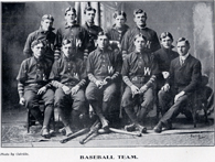
The infamous Washburn “W” is easily recognized these days. However, many fail to realize just how long it has been a part of Ichabod history. The first visual evidence of the “W” dates back to the 1904 debut of the “Kaw” yearbook. A group shot of the baseball team clearly reveals the “W” on the men’s uniforms. Additionally, a 1908 yearbook spread shows football athletes wearing sweaters featuring the large, bold “W.” So, what’s changed from then to now? Martha Imparato, special collections librarian, believes that the largest difference in the “W”‘s appearance is the font. “The “W” wasn’t at all standardized in the early 20th century,” said Imparato. “While the font used on the baseball uniforms could be described as a thick Arial, the font used for the ‘W’ on student handbooks seemed to vary with each few years.”In fact, it wasn’t until the early 1980s that the use of a Times New Roman font was finally settled upon for the student handbook covers. “Today, the use of the ‘W’ logo is extremely standardized due to its recent licensing,” said Imparato. With changes in the modern-day technological environment it has become far easier to reproduce logos. In 2005 Washburn University’s “W” logo became an administered trademark, protecting it from illegal use. The Washburn crests and the Ichabod mascot are also protected under the trademark. While the Ichabod mascot existed in name for 70 years, its graphic appearance was first adopted in 1938. Bradbury Thompson, who would later become a well-known graphic artist, designed the mascot. The name Ichabod was taken from Ichabod Washburn, a Massachusetts philanthropist and significant contributor to the university. Originally founded as Lincoln College in 1865, the university faced bankruptcy three years later. Washburn donated $25,000 to the school, leading the institute to change its name to Washburn College.Currently the athletic department primarily uses the “W” logo. The bookstore also has rights to the logo under the licensing guidelines. “Licensing is something that has become common with universities,” said Dena Anson, director of university relations. “It protects the reputation of the school and it holds the licensed vendors and merchant producers accountable.”While recent adaptations have been made to the logo, such as a white rim around the “W” instead of the shadow, Anson believes that many of the changes have to do with the advances in electronic media. “Modes of printing have changed from how they used to be, and with that you’re bound to see a change in appearance of the font,” said Anson.